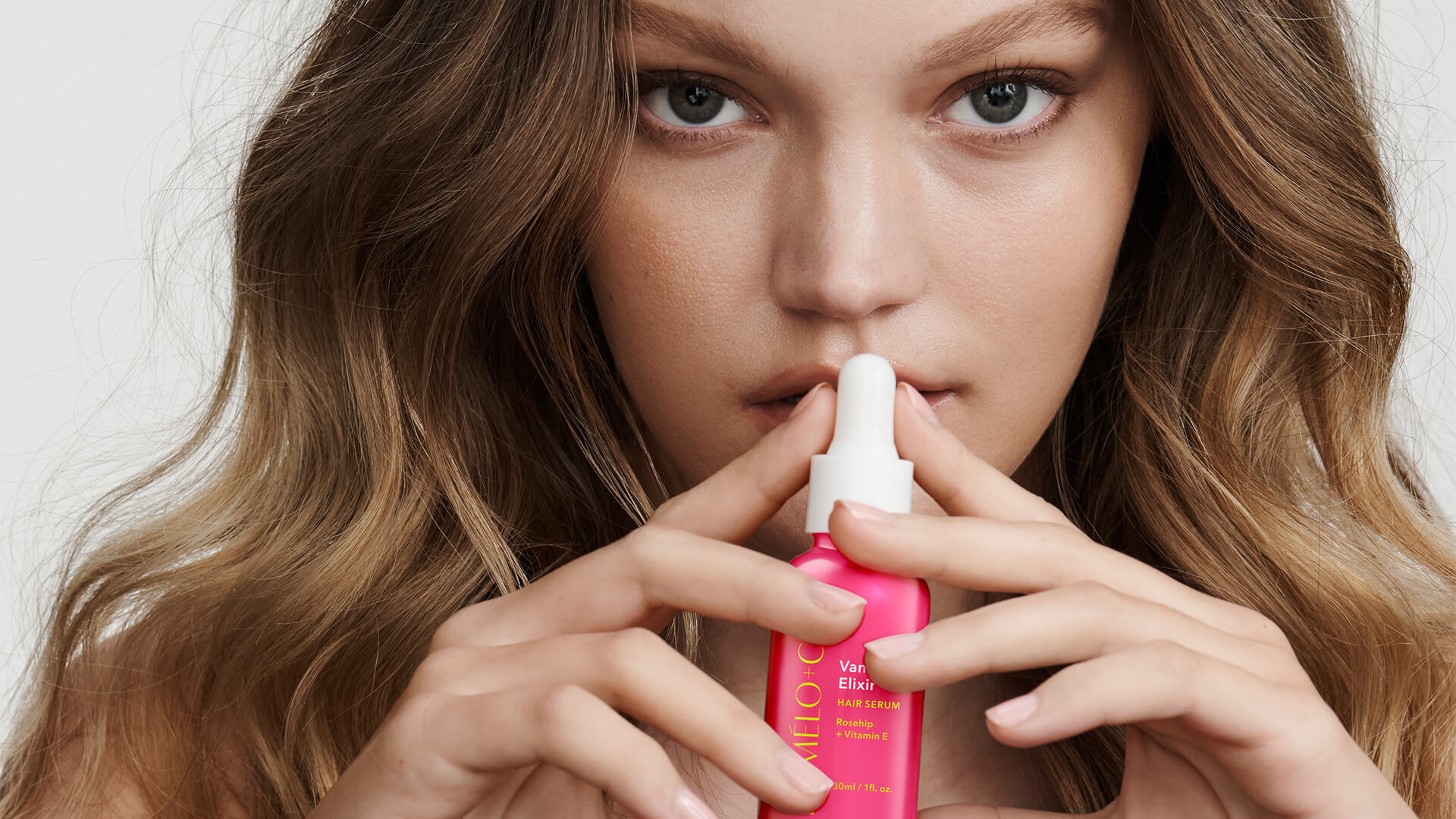
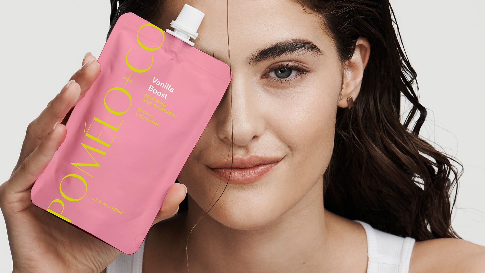
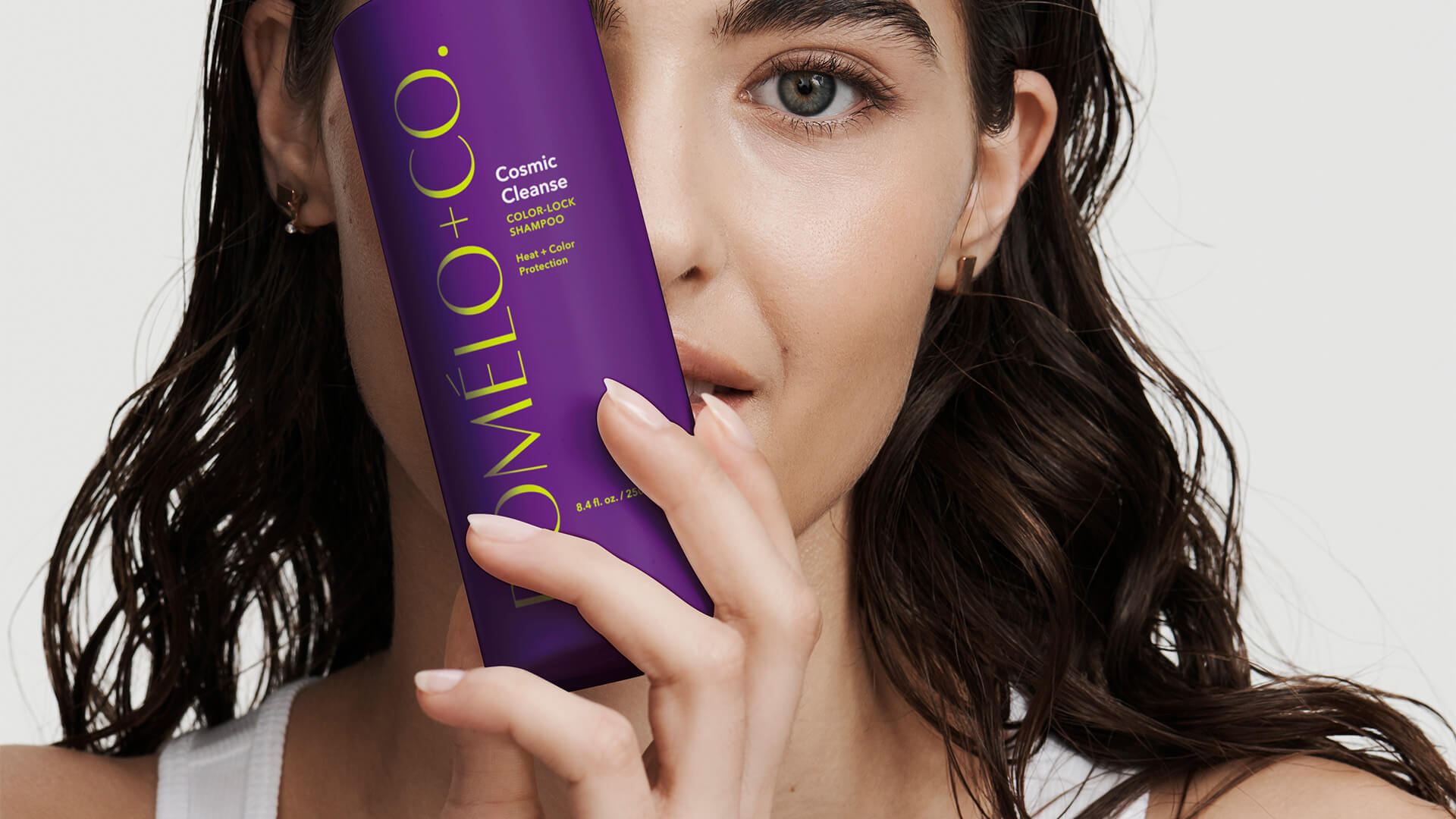
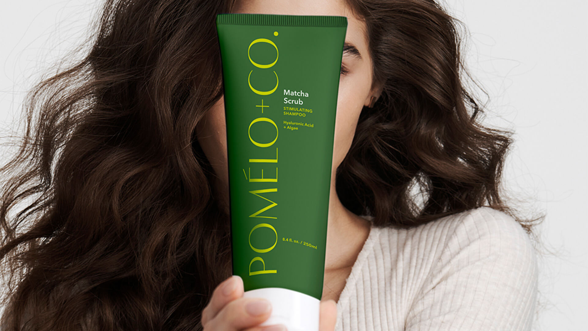
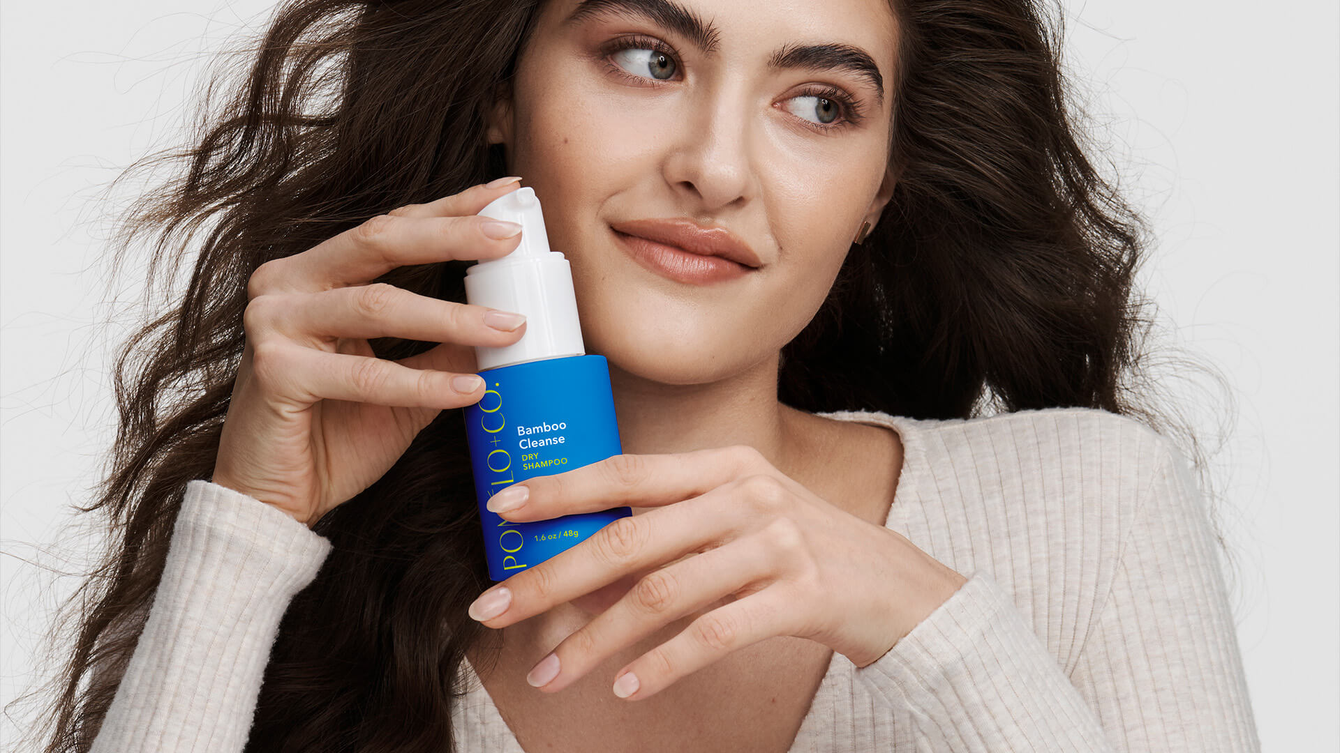
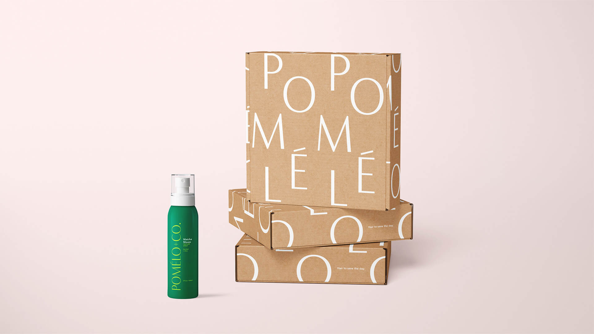
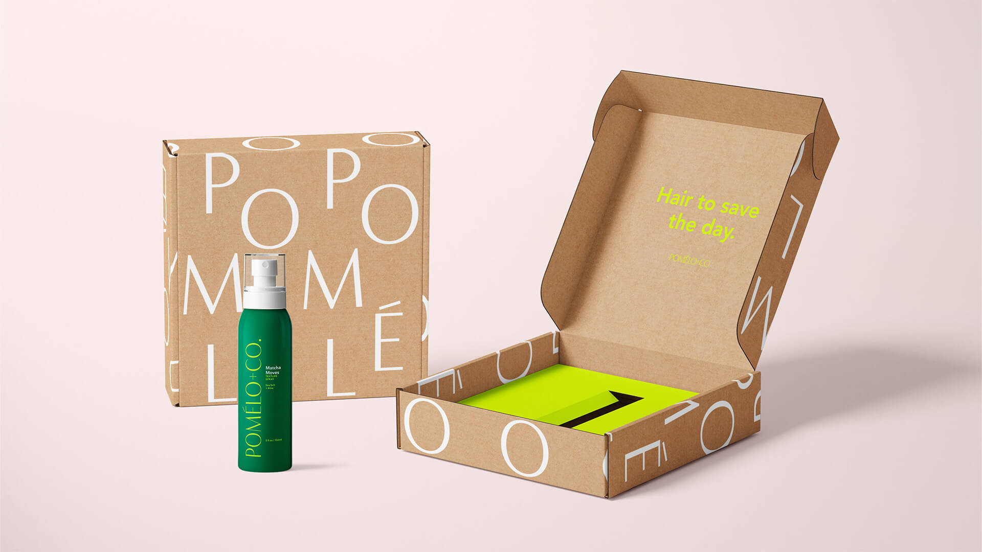
Pomelo, a popular European haircare brand, was perfectly positioned for a complete identity refresh.
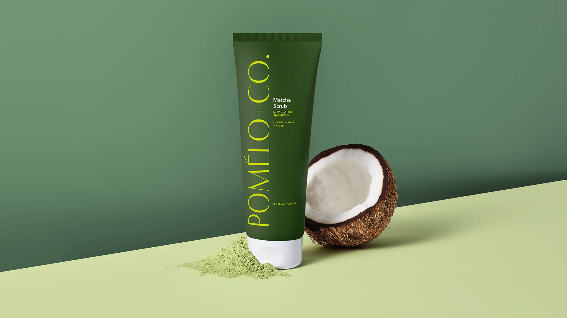
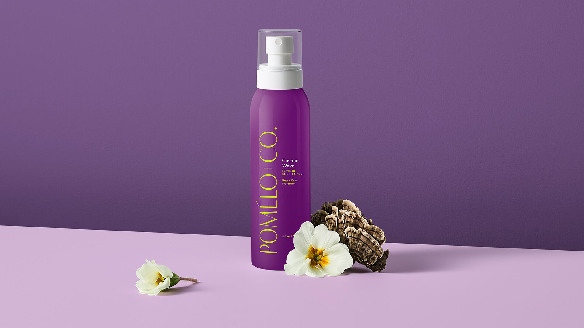
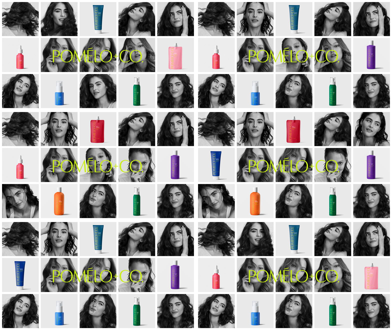
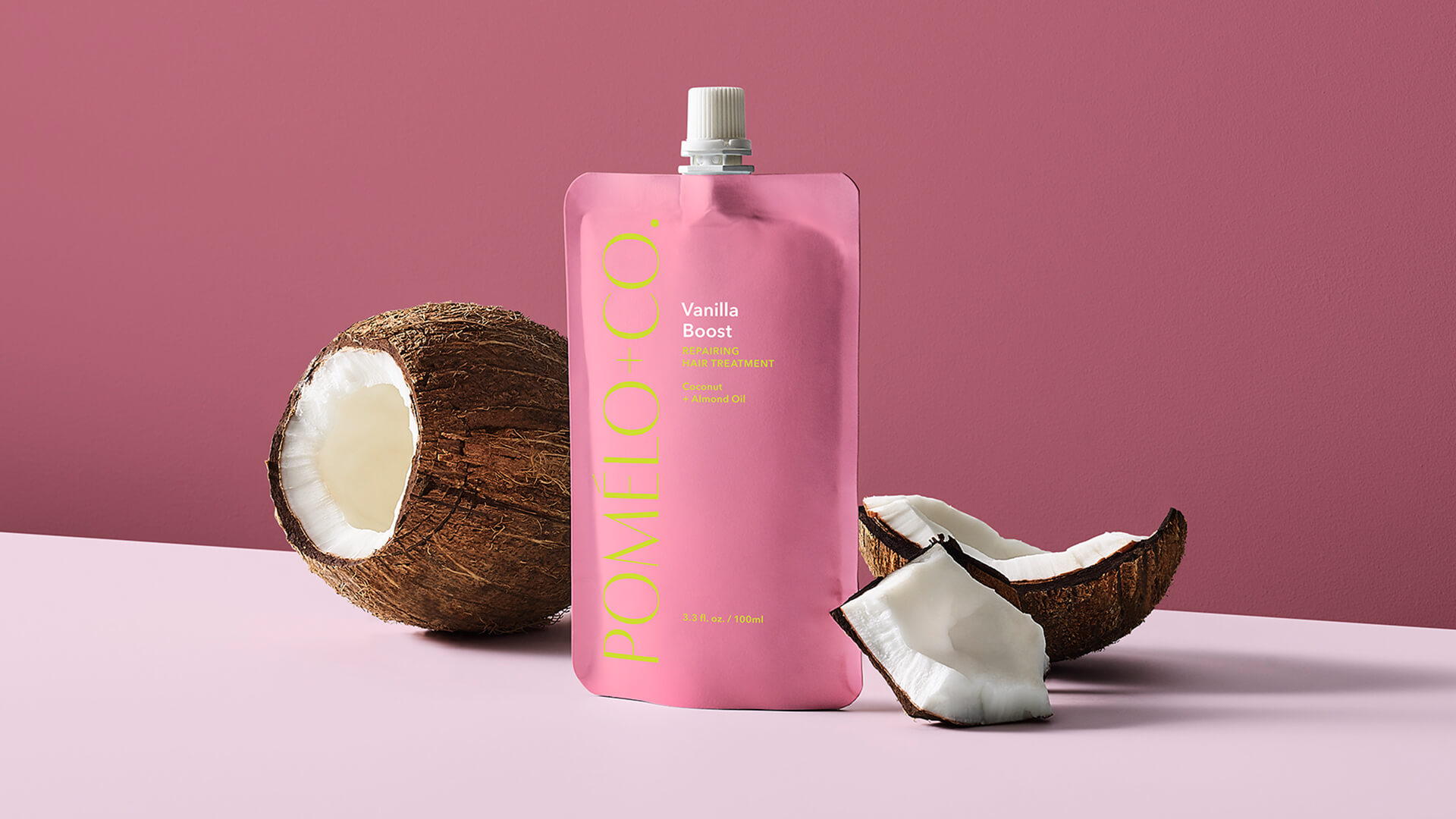
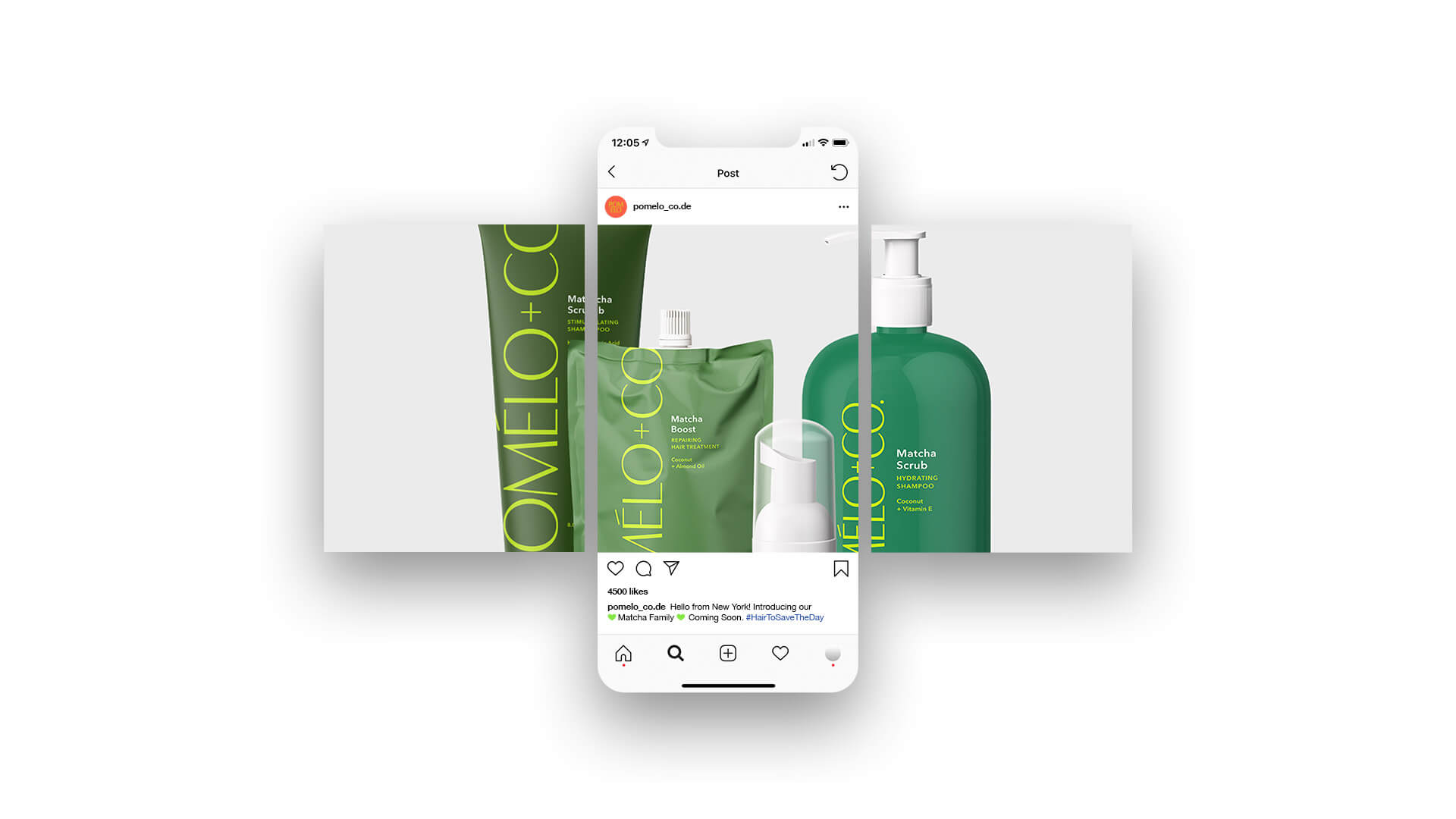
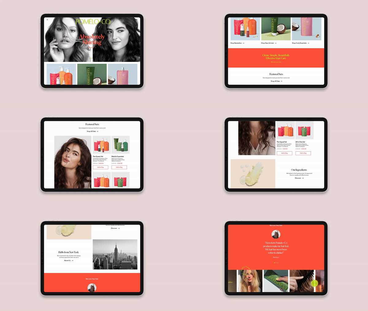
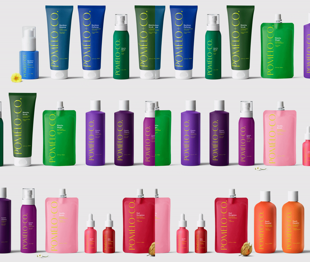
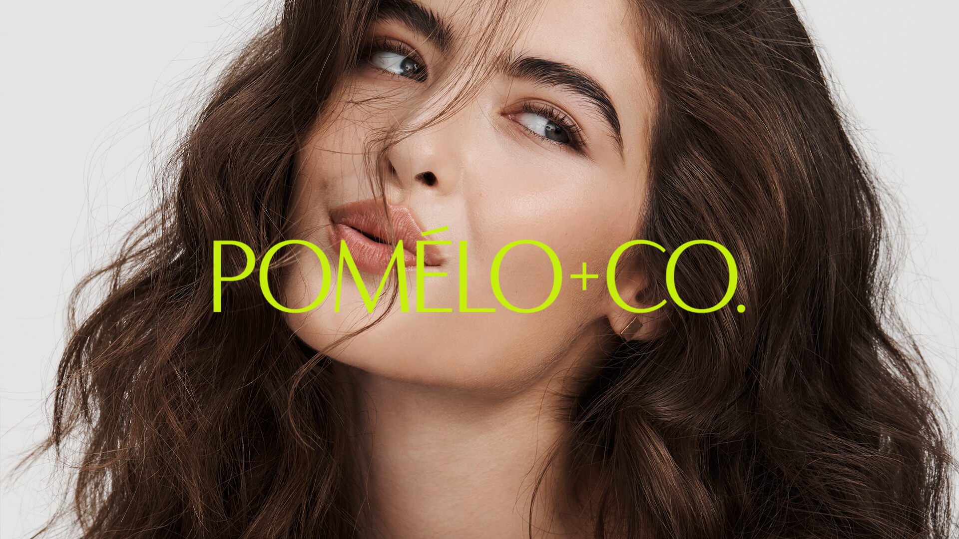
They had built a healthy social following relying mostly on influencers, but needed a more cohesive, elevated look and tone to take things to the next level. It was an opportunity to not only refine the visual elements of the brand, but also to reposition them as a more desirable choice when the influencer marketing status quo had nearly run its course. Starting with a sophisticated new word mark, we created the new identity from the ground up. Logos, color palettes, and packaging design redefined the brand’s visual foundation; which then influenced new art direction, photography style, website design, and a refreshed tone of voice. The results speak to the brand’s DNA: fun, bright, the healthiest ingredients, and confidence without compromise.

